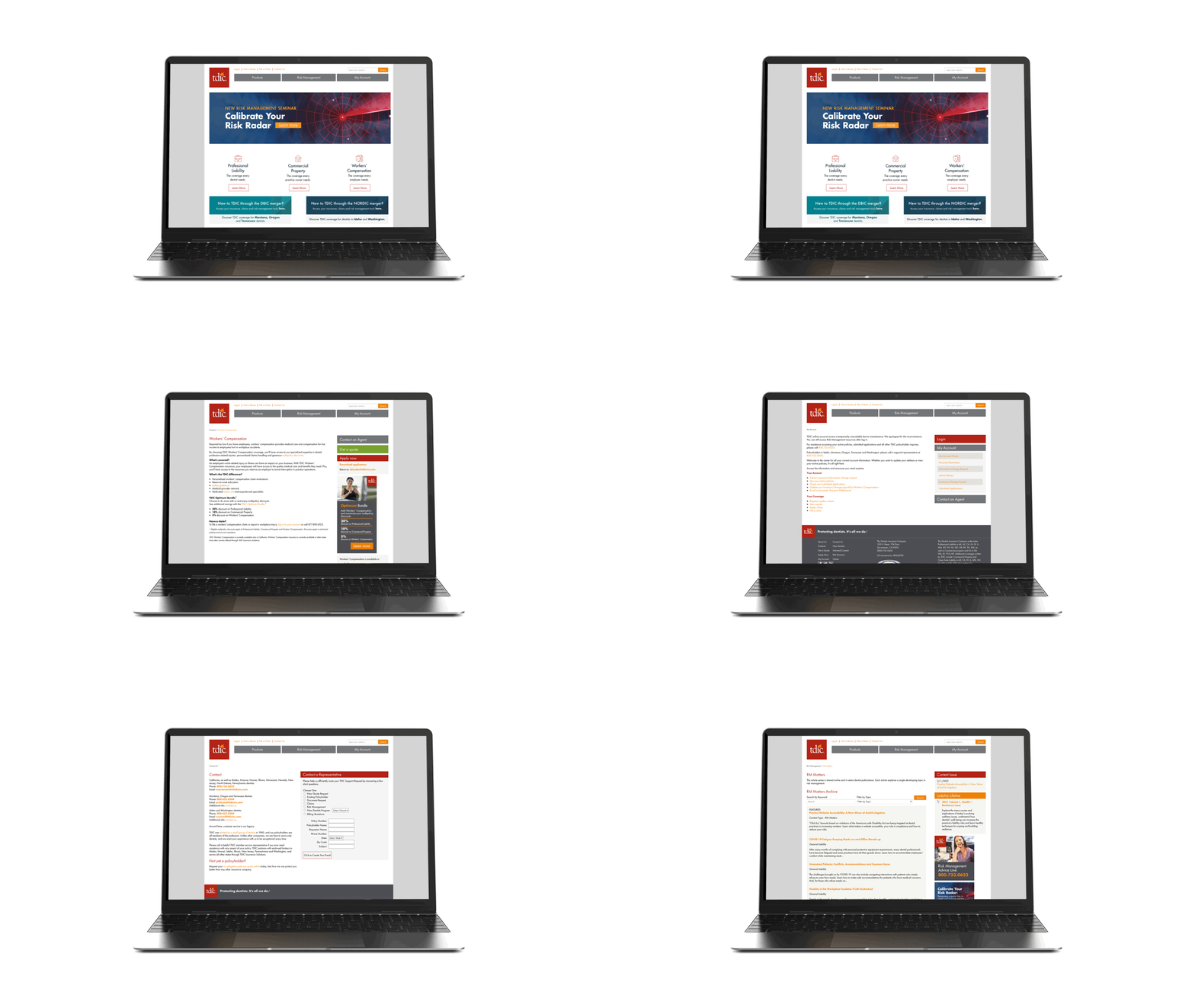
The Dentists Insurance Company Website Redesign
The Dentists Insurance Company (TDIC), a subsidiary of the California Dental Association, underwrites Professional Liability policies, Commercial Property, and Workers’ Compensation coverage exclusively for dentists.
Year of Completion: 2021
Kind of Project: Website Redesign.
Discipline: UX Research, UX Strategy, UX Design, UI Design, Visual design
Team Credits: Aline Jalalian, Shelly Peppel and Candace Coulombe.
To Redesign a Website.
TDIC's website is outdated and is experiencing diminishing returns and degrading performance. The website is no longer competitive and does not have a clear strategic product roadmap for how to grow, optimize and scale online to serve current policyholders and new potential policyholders with the current company growth strategies. Through a series of user studies and stakeholder sessions, the following pain points were identified:
User Pain Points.
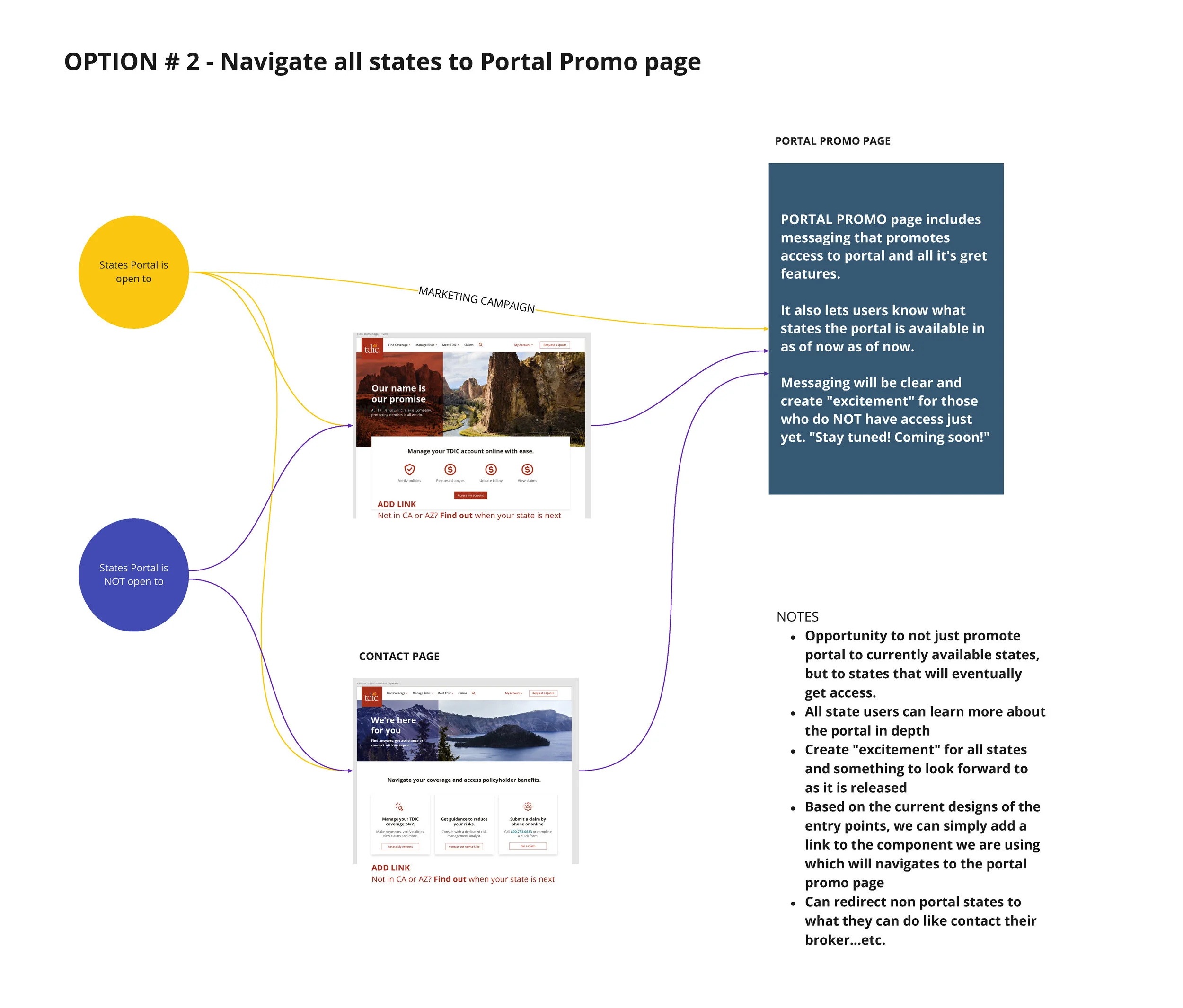
Users have a hard time understanding which products are available in their location.
Limited online services; users are forced to call in order to perform most tasks.
It’s hard to locate resources, such as Risk Management forms or articles.
Business Pain Points.
The current site is hard to update and maintain.
Policyholders have to call in order to make any and all changes to their policy. Call center agents are overwhelmed, business opportunities are often lost.
There’s no single source of “truth” that agents can use with prospective policyholders.
Discovery.
Product Spec.
Due to pressing demands from the business, it was determined to approach the project in phases. MVP was determined to address the main pain point for the users and business: online account management, product availability by location and contact page optimization.
Additional Research.
At this point further research was needed. We conducted interviews with stakeholders in Risk Management, Claims and Customer Support, a competitive analysis workshop was held, and a survey to a user group was deployed. These findings helped corroborate the scope of MVP and shape the personas and pain points that informed the design.
Personas
The Established Policyholder.
In his 40s and 50s, the Established Policyholder (EP) owns their own practice, is loyalty to TDIC and has staff that helps with office and admin tasks. They want to explore other coverages they need to have (ex: when buying a new practice, or opening a new location).
Pain point: When EP wants service or answers, they don't get it in a timely manner because of phone line congestion.
The New Policyholder.
A young dentist, not long out of dental school, the New Policyholder (NP) is looking for modern resources and expects a digital service and experience. They don’t have office staff and do things on their own; no fax machine in this office!
Pain point: NP needs easy to digest explanations of the different products and what they do for them.
The Prospective Policyholder.
An established dentist, the Prospective Policyholder (PP) already has insurance but is not happy with his current products. Residing outside of California, they’re not familiar with TDIC and will have questions about availability and who to contact. Pain point: PP is easily overwhelmed by insurance competitors and wants a clear path to answers or a point of contact.
Designing the User Experience.
I lead the team through several brainstorming sessions in Miro, and conversations with stakeholders and users.
We produced Flows for the most intricate tasks on the site, truly decoding the complexity of the business and distilling it into easy to understand paths. At this stage we also began shaping the Information Architecture and the Taxonomy of the pages.
Wireframes and Components.
The team began a quick round of iterative design, working on two parallel fronts: Design of the page structure via lo-fi wireframes; and design of a UI kit and component library for the company’s CMS (DNN) using 2sxc and Easy DNN News components. This organization of the work allowed the team to use atomic design principles in order to quickly and efficiently implement design patterns. This approach was also budget friendly: We used only 77 out of the 120 dev hours allocated for design implementation.
Direct message me for password.
Building a Visual System.
After user testing our lo-fi wireframes and components, we continued the visual exploration and refined the high fidelity prototype. We fine-tuned photo choice, color, micro-typography and iconography. During this stage we made sure that the look and feel matched the functionality and usability we had built, as well as the stakeholder and user expectations.
Final Prototype.
After all final refinements, user feedback, stakeholder adjustments and design details were in, we completed the handoff process by creating a master file and prototype with all pages, as well as selected flows used for testing. In these examples we can see the solutions for the initial pain points: Easy identification of products available by location, well organized Risk Management resources and online account management for all users.
Direct message me for password.


